


It seems from the comments on the Duke Nukem comic that a lot of people don’t really understand what Uncanny Valley is, or why it’s horrible and creepy and something no designer should approve of unless they’re in the horror business (in which case you need to push it to the limit). “Uncanny Valley” does not necessarily refer to things that are trying to be realistic, nor does it mean “anything you think is ugly”. Specifically, the term “Uncanny Valley” was meant to refer to robots, saying that people will like things that look like obvious abstractions of people, and people will like things that look exactly like people, but people are repulsed by things that look almost like people but not quite.
You can hit up the Wikipedia page on the matter for an in-depth explanation of exactly what it means, but I broke it all down into easily digestible pictures of how this all relates to design because I felt like drawing toasters and gluing eyes on lions when I got home from work today.
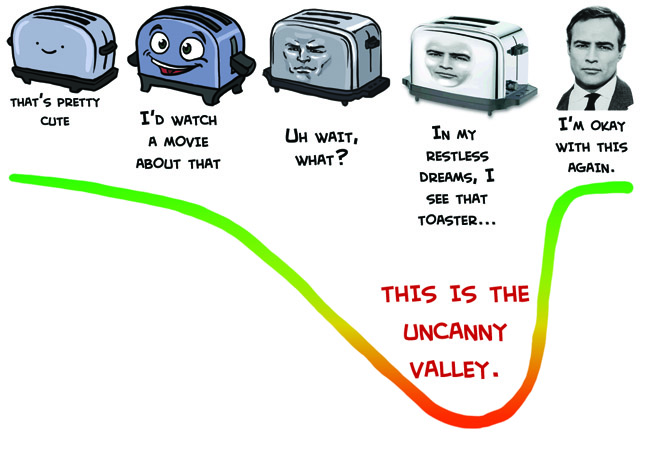
If we made a graph of how much people enjoy watching something move around VS level of realism, the “Uncanny Valley” is that dip where something is too much like a person without actually looking like a person for people to respond positively to it. It’s basically why Tweenbots and Arnold Schwarzenegger have an easier time making friends than the Japanese speaking robot mouth thing.
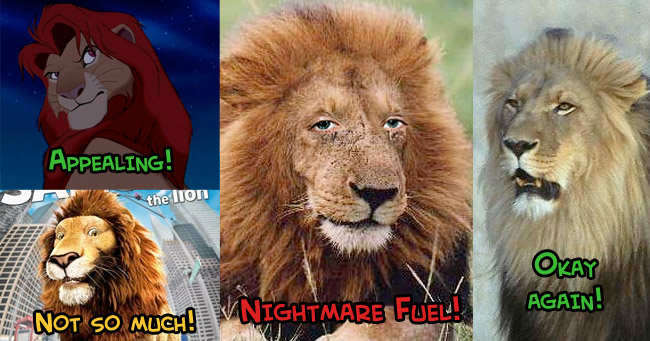
If you want something non-human to emote like a human, you can’t just slap human eyes on it and call it a day. Back in the day sometime in first year animation class we were doing four-legged animal walk cycles, of animals randomly chosen out of a hat. The teacher warned us that people who got things like cats and dogs were probably going to have a harder time than people who got things like bears and raccoons, because people are so familiar with those animals that they’ll always notice right away if something looks wrong. This goes for anything people have a point of reference for. I would assume that furry art wouldn’t be quite as popular as it is if the cute cartoon girls were replaced with realistic human-animal mashups, at least.
It’s important to understand the limits of a style you’ve chose to work in. Realistic designs have to move realistically, stylized cartoons have to move like cartoons. Disney’s Cinderella can’t make the same boisterous exaggerated acting that her stepsisters do because her design is so much more conservative than theirs that it would look absurd and out of place. When cartoony characters move like humans, you get that cheap rotoscope/mo-cap look, but when real people move like cartoons you get the Black Hole Sun music video;
Which nicely segues into the rule of uncanny valley that most CG studios seem to be actively ignoring these days, which is that things should only have realistic texture if they have realistic proportions. Personally, I really hate the idea that cartoon animals should have hyper realistic fur. It makes them look like kids’ plush animals made out of real animal pelts (This is a real thing I have seen done, there is no worse way to show off that prized lynx you bagged than by skinning it and making a plush bunny out of it). Peter Jackson is all excited to talk about his realistic CG Tintin movie where you’ll be able to see all of Tintin’s pores and hair follicles, but honestly, cartoon characters with human skin stretched over them just look horrible.
This is all really informal and I didn’t really have a conclusion planned, so I’ll just remind you to look at the Muppets with People Eyes tumblr every time you start feeling like Uncanny Valley isn’t all that bad.
Discussion (114) ¬
About three fourths of this website make me go “THANK YOU for stating that so succinctly; someone really had to do so.” This is a such part.
Agreed. There’s really a lot of really bad uncanny valley stuff in CG floating around. We’re getting there in games too, with stuff like Heavy Rain. I hear the problem is when animators who see the gradual transformation from simple shapes to face-like thing are they get used to it gradually and thus don’t experience the uncanny valley at all at the end. Therefore, it’s not until the public see it that they find out about it’s creepiness.
Bloody hell, what is that THING there, feeding its… its spawn?! Talk about nightmare fuel!!
It’s a sculpture by Patricia Piccinini. She deliberately specializes in the Uncanny Valley. If you appreciate the beauty in horror as I do, her stuff is actually really fascinating.
WHY U DO DIS??!?!?!
And by this, I mean nightmares.
I love that the Swedish prime minister is one of your examples.
Oh, thanks, now I know exactly what my dreams will be about today: real people with huge cartoonish grins.
Remember when you’re a little kid and there’s always that aunt that says you’re so cute she could eat you? Yea, imagine taht now! D:
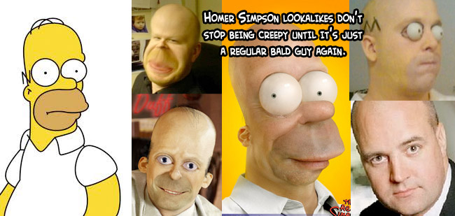
I love the fact that the “regular bald guy” in the Homer Simpson lookalikes is the Swedish Prime Minister.
Gotta say, he’s the most ordinary looking human being I’ve ever seen.
just FYI, that bold guy in the simpsons pic is the prime minister of sweden. It makes the pic a little more fun.
That last Homer lookalike is the Prime minister of sweden, I’ve never thought about his resemblance to Homer Simpson…
Ahahaha, I honestly didn’t know who it was, I just typed “homer Simpson lookalike” into google.
…find that just hilarious. Even you’re creative process is funny, gold star!
YOUR. Oh god.
Great article. Incidentally, this is similar to the reason why people hate bad acting in movies and plays. We reject it as realistic human behavior, because we’ve seen it so many times, just like with the cat in the animation class. But when we get really far from reality (musicals, modern dance) we accept the notion of human behavior without difficulty.
That’s exactly what I thought when I discovered images of the characters from the new Tintin movie ! When you compare them with the actors of the old Tintin and the blue oranges movie or the comics character…
I wonder how long it will take some one to photoshop Cosplay jonesy with her CoffeeFace. Oh 7 Gods that face along with any interaction with it makes me think she going to bite a human head off then wash it down with Starbucks. Well thanks now jonesy in my nightmares.
D: Well thankfully it hasn’t happened yet. Though after reading the article I wanted to do an Uncanny Valley Jonesy.
Wow, I’d never seen the “Muppets with People Eyes” page, but you’re right, that hits the nail RIGHT on the head about the Uncanny Valley. The only muppets which didn’t creep me the hell out immediately where Statler and Waldorf exactly because they are the most human. Gonzo looked evil, while even Elmo looked creepy as hell. Very good post on something many artists and other creative types get WAY wrong.
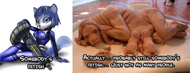
What bothers me is how many of them turn into the birthday dog.
http://pics.blameitonthevoices.com/022010/small_birthday%20dog.jpg
Meh, most of those muppets are creepy because their eyes are put back in the wrong place. Miss Piggy, having “realistic” eyes in the first place, barely looks different, let alone disturbing.
I keep seeing that… Dog thing in old ads. Exactly what’s the origin of that? Never got to finding out (and I don’t think I really want to if it’s not just photoshop).
It’s actually a sculpture by Patricia Piccinini. Some wiseasses started passing it around online with a colorful variety of stupid stories, but that’s where it’s from. The artist has a real knack for horrifyingly creepy lifelike creatures.
http://www.patriciapiccinini.net/
Man, now I really want to watch the Brave Little Toaster again. I loved that movie as a kid. The whole Robert Zemeckis style of CG animated movies has really bothered me. The designs are just so unappealing and creepy. Also I feel today’s hyper-realism looks like yesterday’s old trash in the future. More stylized animated movies/video games I think tend to stand the test of time better. To me Final Fantasy VI looks a whole lot better then Final Fantasy VII. Now in a world where we did up every tv show/movie/special and put it out on DVD and such I’d think looking “evergreen” would be just as important as looking flashy today. Though a lot of people in Hollywood seem to be missing that concept.
Thank you for this. This is better than any explanation I’ve ever tried to give my students (and many of them still don’t understand and keep making horrifying realistic cartoon people). I’ll be linking them to this from now on.
Thanks, I had just gotten my sleep patterns back to normal. We know we can’t have that.
Extra Credit Points for making your first Example The Brave Little “MOTHERFUCKIN” Toaster.
You Madam win today’s allotment of internets.
Seconded.
The “Uh, wait, what?” toaster actually looks pretty badass awesome. Could be because it does dip into the Valley just slightly in the manner of John Kricfalusi, which I love and find hilarious.
Unsolicited comic idea, which I know you LOVE, but here it goes: Toaster applies at the Agency (With that face. Period.). Questioned about his qualifications, many jokes ensue about how The Brave Little Toaster was actually so hardcore and terrifying and a brilliant comment on then-blossoming 1980s consumerism. Stories about the rest of the gang going off to deal with their issues like a grizzled band of ‘Nam vets would be much appreciated.
Thank you so much for writing this.
I love how the uncanny toaster looks so much like Mussolini’s Lair
http://www.i-italy.org/files/news/Mussoliniromasedemovimento_1255270513.jpg
I read somewhere else a sentence that summed it all up: The more non-human something is, it’s easier for us to notice its human characteristics. When it gets too human-like, all we can see are the non-human characteristics.
Haha.. How did you find the regular bald guy. And I assume you know it to be the Swedish prime minister.
I actually just typed in “Homer Simpson Lookalike” on google and he was the most accurate thing that came up.
How coincidental is it that right after reading this, I get linked to this video. I think it really shows how freakin’ creepy that valley can go.
Okay, someone else found that. Was just coming here to link to the whole article, because I just found it and was like HAY THIS IS RELEVANT.
Though it does have a goatee, so there is a possibility that it is some real person’s doppelganger.
Actually, it’s not that coincidental at all, the uncanny valley is one of those special things that cuts across wide swaths of interests and professions. Indeed, though you’d expect that it falls mainly in the purview of the cartoonist, animator, and artist, it has gained a lot of notoriety in the robotics field, as interfacing and interacting with robots is understandably of interest to a robot designer. Especially where the two intersect, take for instance the remake of Flubber with Robin Williams, and the robots in that film, or even the more recent Iron Man movies in which Tony Stark talks to his robot hand which has two LED “eyes” and a “nose” formed by part of it grabby claw thingy (manipulator). In real applications we have the face robots including the one linked, but there are also more simplistic ones on the other side of the valley that are also being used, i believe i heard something about an egg shaped robot teaching English in Korea, or somewhere. So yea, the uncanny valley is highly applicable to robotics and it is therefore unsurprising you found a related video. Though it says good things about your friends that they linked one too you. :)
Dear Kelly,
Please make a spin-off comic about the middle Brando toaster there. It is actually amazing.
I understand that people do tend to notice the imperfections in objects that lie in the so called ‘Uncanny Valley’, but I still don’t understand why people feel bothered by them.
It’s hypothesized that things that look real but off set off our trigger that something is unhealthy, deformed, or a decoy of some sort. If you have no aversion the sort of thing it’s possible you have some sort of internal chemical imbalance, and should avoid driving an animated major motion picture. You should take extra precaution when Skynet rises up, as you will not have the same survival reaction a normal human does when they introduce the early rubber-skinned T-600 model terminator.
I lol’d
One theory is that it supposedly exaggerates the lack of humanity within the vessel imitating a human, and is something that we’re genetically hardwired to find horrific, perhaps as some kind of evolutionary protection from warping the gene pool. Hence, fear of zombies: it looks like Aunt Mavis walking up the driveway, but why are her eyes milky and why is her jaw hanging loose?
Tintin looks creepy – they’ve taken Herge’s appealing design and made it unappealing by not understanding it’s not realism that makes a character appealing to begin with.
I see kid’s books with appealing character designs all the time, and don’t understand why it isn’t used in movies that are aimed at kids. Make the characters fun to look first; then give them creative, interesting voices that kids will immediately want to imitate, and the job is mainly done for you.
Make no mistake: I can clearly differentiate between human and non-human quite well. There’s just no visceral sensation, attitude, or feeling that accompanies it.
There’s just the thought of “that’s not a normal human being,” without being weirded out.
Wow…Fredrik Reinfeldt (Swedish Prime Minister)….I will never be able to look at him the same way again :P
AUAHUGH
Nothing to say that hasn’t already been said, but… here’s the mouth, remixed. Not quite as creepy: http://www.youtube.com/watch?v=6Zi0_4xHS40&NR=1
Great article as always!
I wonder, did Avatar not fall in this trap because the Na’vi, though very human-like, is outside our frame of reference, or because James Cameron got something right that everyone else is getting wrong – perhaps even leaping across that last bit of the canyon?
People who worked on the movie have gone on record saying the Na’vi looked acceptable both because they weren’t trying to look like humans and because the animators did so much work to enhance the mocapped footage. They look realistic, but we have no frame of reference for what a nine foot blue cat person is “supposed” to look like or move like, so we accept that that’s okay. Even the Na’vi that were more “human like” in appearance were verging on off-putting, like the Sigourney Weaver one wasn’t quite as pleasant to look at at the Natiri one, because it looked a little too much like Sigourney Weaver.
Also I think there needs to be a little antialiasing applied around that right eye. The join between eyelid and eyeball looks funky.
But yeah, that is creepy.
The Na’avi failed on me so bad. Then again, all that movie failed horribly for me. Every time I saw a na’avi, I wanted to hit a blue kitten. The art was amazing, but something in me made me rage whenever I saw one. I actually couldn’t buy the planet as organic or viable.
Thanks once again for explaining and representing things in such a clear manner! I’m sure to point anyone who’s confused about the Uncanny Valley here.
I also have a couple of related questions. A lot of times it’s mentioned that video games do the motion capturing. But personally, I’m only slightly bothered by it, the creepiness feels no where near the levels of the uncanny 3D animations that were mentioned. Is it different for games? Or is it just me? If it is, what makes it even slightly more acceptable? Would 3D games look better hand animated?
I didn’t make myself clear, I wasn’t saying the Simpsons are an example of the uncanny valley, I was saying they are ugly, and that we get used to ugly. Read Hate long enough, and you parse Peter Bagge’s deliberately loathsome designs as human beings. Our perceptions are malleable.
Mocap is going to become a household level technology within months. We are going to get used to it. The uncanny valley is going to shrink, it’s inevitable.
Simpsons is still a fairly weak example because the models and design of the show change on an almost seasonal basis. The original series was produced by Klasy Csupo, the same people who brought us Real Monsters, Rugrats, Duckman, Wild Thornberries, and as Told by Ginger. Now the series is done by Film Roman and not only the designs, but the animation style has wildly changed. Even in the past decade or so, the designs have been extensively refined from what people think of as the “Golden years” of the Simpsons. The designs that people thought were weird and ugly are still thought of as weird and ugly, the designs that are cute and round and appealing are the ones people have gotten used to.
I think it’s both a good and bad example – I’m almost 15 years older than you, and I suspect the Simpsons look has always been there in the background for you so you can’t help but find it normal. Kids growing up today are similarly going to encounter a ton of mocap in the coming years so the “raised hackles” reaction we have is not going to be the same for them.
The best example of uncanny valley is a corpse. People who spend a lot of time around corpses get used to them. Same difference.
No, I mean, the “ugly” simpsons designs are still considered “ugly”, the aesthetic of the rugrats has been compared to a sack of babies that were beaten against a ceiling fan for the whole of the show’s 20 year lifespan despite the massive success it saw. Offbeat styles will almost always find their niche, but they don’t rewrite human nature. Coin operated fortune tellers have been around for generations, but people still champion them as creepy. If you run a popularity contest between a Keepon, early 90’s Robert Patrick, and Zoltan, Zoltan’s probably going to be the clear loser even though he’s been on the scene since the 1960’s. People can get used to things, but that doesn’t make them appealing. Using your example of people who work with corpses, sure, they aren’t AFRAID of them anymore, but it’s not considered normal to prefer their presence to that of healthy living humans or appealing abstractions thereof.
Agh, Rugrats, can’t stand to look at the damn things.
I just think human nature is a lot more flexible than you give it credit for, culture and environment and fashion change and sweep us along with it. 2 dudes kissing still gets some people really upset, but do you really think it’s having the same negative reaction as it would’ve had 40 or even 20 years ago? No, because we’re collectively increasingly accustomed to it.
Also, while I mainly agree with your choices in aesthetics, I think it’s a mistake to take a quirk of human psychology like the uncanny valley as some sort of mandate from on high as to what is right and proper in animation.
And Rugrats are a perfect example of something “ugly” that’s been around for decades still being ugly.
Either way, offbeat styles don’t have a whole lot to do with uncanny valley because that’s more of an issue of taste where uncanny valley is a deep rooted psychological aversion. It is true that there are rules that apply to design that will make things appeal to the lowest common denominator and the further you deviate from that the more niche the appeal of your designs is, and that’s why you don’t see any animated feature length family friendly Disney movies drawn like Korgoth of Barbaria, Dora The Explorer doesn’t look like Sin City, and Gerald Scarfe’s designs in Disney’s Hercules are a far step removed from his designs in The Wall, but it’s still kind of a different concept.
I’m not sure why you’re comparing guys kissing with an ingrained aversion to deformed things we’ve developed to prevent damaging genes and illness from entering our gene pool, they’re uh… pretty much completely different sociological cans of worms
And obviously if technology will let us do something people are going to try to do it, so weird creepy ugly semi-realistic movies are going to see their place in the spotlight, what I don’t like is guys in suits who know more about celebrity popularity than they do about catroons deciding that THIS IS THE FUTURE OF ANIMATION! We can put a bunch of ping pong balls on Jim Carrey or Seth Green or Tom Hanks and the cartoon will move around like them and it’s like they’re really acting! Then we can make a photorealistic dead-eyed Angelina Jolie model and have Angelina Jolie do the voice and mocap Angelina Jolie’s acting! This is probably what people want to see because people like Angelina Jolie! It’s like the next level of the dependence on celebrity voice actors, istead of creating characters, they try to cash in on celebrity names and likenesses. A good animator is an actor unto themself, when you make a movie that relies that heavily on mocap you don’t get the same insteresting composite character with a unique personality that you would if you teamed up a talented animator with voice actor who has an aptitude for animation, you just get an actor in a cartoon suit. And depending on how real they try to make that cartoon suit look, it’s going to look more and more like a person trying to wear somebody else’s skin.
I guess what it comes down to is sure, like your morticians who get used to being around corpses but would probably rather hang out with healthy living humans; people will accept unnervingly uncanny movies if it’s all you give them but, as soon as something with solid design sensibility and appropriately matched acting comes on the scene they’re going to want to watch that instead.
Hm, I liked Beowulf, actually. Though I agree having Angelina monster be just Angelina dipped in gold paint was a wasted opportunity, Beowulf’s actor Ray Winstone looks nothing like the character though, and I thought Crispin Glover’s Grendel was neat too. And Gaiman’s reframing of the myth making Beowulf an unreliable narrator was a stroke of genious.
Still seeing things as ugly isn’t the same as feeling aversion, being actively disgusted by something is a high voltage emotion, it can’t be maintained indefinitely. I retain an aversion for the rugrats because I’m free to change the channel whenever they turn up, but if I was forced to watch a whole season for some reason I’d eventually come to tolerate them. I’d still think they’re ugly.
Dudes kissing is an example of something that causes aversion in people but is slowly losing it’s edge – obvious in both the fact that Javier Bardem kissed Josh Brolin at the oscars and that the kiss was not broadcast on TV.
It later occurred to me that there’s another even better example of uncanny valley, that is transsexuals and cross dressers who look almost right but not quite. And sure enough, a quick google search finds people undergoing sex change talking about the uncanny valley effect they experienced themselves. One would hope that aversion too can be decreased with familiarity.
Anyway, looks like imagemovers is closing it’s doors, so maybe you’ll get your wish and the devil’s rotoscope will fall out of fashion, and maybe we’ll get lucky and someone will beat sense into Spielberg before he subjects us to Tintin’s pores.
…But I think mocap is here to stay, and we’re just going to get used to it and kids growing up now are just going to see it as “the way people look on TV sometimes”
My point is that “guys kissing” causes aversion in some poeple for COMPLETELY different biological and sociological reasons than aversion to corpses and uncanny character designs, but we’ve pretty much run this into the ground. You don’t seem to catch that I’m saying people will get USED to something, but they still won’t PREFER it. Again, bringing transvestites into it is still a different matter than animation and movie character design because they’re real human beings with personalities and feelings and interpersonal relations, not robots and cartoon characters that exist as pixels on a screen. No matter how long uncanny mocap is around and how used to it people get and how many generations grow old and die with it, people are still going to be inclined to favour the first alternative that comes along with real thought and attention to the design. You may have liked Boewulf, but I would bet good money that even MORE people would have liked it and it wouldn’t have been immediately forgotten if the same script was done in hand-drawn two dimensional feature quality animation with solid design sensibilities a la Disney, Dreamworks, or even Bluth. Or if the same script was done with living actors and convincing CG-enhanced practical effects like you’d see with a Del Toro movie. I know people who didn’t bother to see the movie because they thought it looked weird. And people who did see it but didn’t enjoy it because they thought it looked weird. They couldn’t get into the story because the visuals were so offputting, and this isn’t even just other stuck up animation people who make a living off of cartoons like me, this is regular teachers and blue collar workers who would have otherwise probably enjoyed the story and bought all the DVDS and T-shirts and replica weapons and the like. I saw the movie more as a “look what we can do” kind of experiment like Spirits Within than something that was supposed to live on in the hearts and minds of viewers. The question that follows is “should we keep doing this for anything other than scientific curiosity”.
I loved the story for Beowulf and I was so thankful that it was put to film again, but I could never bring myself to watch it past a second time. The animation was a perfect example of uncanny valley and I’m glad it was mentioned. You’re right with all of your points here. Uncanny valley isn’t about REAL people doing things considered socially strange (by some/most), but human imitations doing things too close to real without that necessary spice of realism to ease the nerves. It’s like you’re saying, it has to be real enough to notice how unreal it is, but not real enough to make you alright with it.
My argument is that there is absolutely nothing about human psychology that is completely invariant and unchangeable across the whole population and completely
un-amenable to habituation or acculturation. If this phenomenon is an exception then it is extremely notable, but it isn’t as even a cursory check in this very thread shows: Some people don’t mind it that much.
The character design in ‘Family Guy’ is still as ugly and unappealing as it was on day one, to my eyes. I don’t know why they even bother animating it.
Did anyone see ‘Bolt’, the hydrocephalic dog? Geez, that was ugly design. Over the credits there’s some gorgeous faux Mary Blair illustrations that would have made for a far more visually-entertaining movie.
Maybe the question that should be asked is what exactly does motion capture add to cartoon performance? Like rotoscoping, characters tend to start milking the giant cow at every opportunity. I’ve yet to see CGI characters that give me a sense of characters actually having realistic weight to their movements, and yet the animators of the 20’s and 30’s had that nailed down just with pen and ink.
They’re talking up Tintin as being impressive because you can see ‘the pores on his skin’. Who the hell cares? I re-read those books all through my childhood because they were good stories that were largely fun to look at, and they’re trying to sell me on Tintin’s Pores. *forehead slap*
I feel that some CG feature films, such as How to Train Your Dragon, Megamind (especially Megamind) or Tangled, all do a very nice job of conveying weight. And there are also a few traditionally animated 2D pieces out there that are fairly flat and weightless.
It’s not so much of an issue of the medium as it is animators cutting corners, and it’s MUCH easier to cut corners using CG.
That creepy robot mouth will haunt my dreams. Fuck you very much.
But really though, nothing beats the “Fantastic Hey Hey” video. That shit is horrifying on a good day/
there was a really awesome video lecture on youtube that first taught me the uncanny valley. here it is: http://www.youtube.com/watch?v=FKTAJBQSm10
yours was great, all those pictures were great.
Huh. I *just* had this concept explained to me by a co-worker — though his example was a lot less useful than yours. He used human-Fiona from Shrek, who I never really found creepy. And then there are some real people who trigger uncanny valley for me (treacher collins’ sufferers, for example) who, apparently, “normal” people aren’t freaked out by. I think those “normal” people are lying.
Apparently human Fiona was deep in the uncanny valley in the first attempts to animate the character, so the animation team made a conscious decision to pull back – your friend was probably referencing articles that mentioned that
Trying to find a still of early humanFiona. My Googlefu is weak, apparently.
I don’t think any were released, it’s just something mentioned by some of the animators in a making of video, iirc
Figures. One of the few times I’m actually interested in leaked stuff, it didn’t happen. :P
I can’t stop thinking about Silent Hill 2 told by a toaster a la Brave Little Toaster, and each time I bust up laughing anew.
It is time, my friends, to visit this place called uncanny valley:
Mr. Ando’s Forest
http://www.youtube.com/watch?v=DRF28GvoL7M
1. I love all the random “instructional” giant, well-written comic-less posts(…I love the comics more, but it’s like..pie and fruit. Just because I love the finished product so much, doesn’t mean the raw materials aren’t dang spiffy”
2. AUUUGHHHHAUHG! AAAAAAAH! I just learned today that everything uncanny valley-y gives me heebie jeebies.
You just ruined the simpsons, toasters, random robots, and…things that EXIST as non-living objects as a whole for me. I’m gonna have goddamn nightmares about brave little toaster tonight.
I’m going to have vivid fever dreams that there is something HIDEOUS after me, coveting my very flesh
The next time I need a handy, linked explanation of the Uncanny Valley effect, I’m probably going to link here instead of Wikipedia. This is GOOD.
Haha, I remember seeing the Black Hole Sun video on Beavis and Butthead. Good times…
But yeah, that thing was fucked up.
Black Hole Sun is actually a great example of taking advantage of Uncanny Valley. It’s supposed to be unnerving and disconcerting, it’s right in the lyrics. That’s what takes Black Hole Sun from High Octane Nightmare Fuel into a sheer awesome video. The mood of the music mixes with the horror of the video and classic music is made.
Uncanny Valley isn’t always a bad thing in the hands of a skilled creator.
The point of it is that it unnerves us, so if you’re trying to make something unnerving, it’s the perfect application of it.
Dammit, now I have to go listen to Black Hole Sun.
:3
Thank you for explaining that, im new to style definitions, so i was really given an example of what that term met except “wierd”
by the way thaty muppet with people eyes will give me nightmares for several years thanks!
So, I’m guessing Tintin is going to be done using motion-capture animation as well? Seriously, the only time I ever liked it was when they used it for Smeagol… I don’t understand why people are still trying to sell that…
This reminded me of the pikachu-men that I’ve seen randomly on the internet. Probably not exactly along the same lines of uncanny..-ness…but maybe this is? http://www.meh.ro/wp-content/uploads/2011/01/meh.ro6504.jpg
The horror! The horror! Kill it with fire!
Heh. As if you wouldn’t love a toaster with Marlon Brando’s face on it.
Creepy, creepy toaster. @_@
I tend to agree on the realistic fur on cartoon animals thing, but I gotta say though, I really liked the realistic rendering in How to Train Your Dragon.
Actually, Miss Piggy doesn’t look that bad with human eyes.
Let’s not also forget that there are large companies specialising in Uncanny Valley at the moment. For example, Sony’s massive PS3 campaign a few years ago, in adverts like this one: http://www.youtube.com/watch?v=0dpzhMMFk5U
That almost made me not want a PS3 when I saw it.
Muppets with People Eyes.
Well, there goes my ability to sleep for the next week.
Seeing our prime minister as a Homer Simpson lookalike made my day. Now I won’t be able to look at him the same way ever again.
Awesome read overall!
Cracked.com has atleast one article about this
The human Homer is going to haunt my dreams for ever now… thank you Coelasquid.
So there is a name for my aversion to motion capture movies like the Polar Express! I’ve heard the term uncanny valley before but until this article I never knew what it actually was. When I saw they were doing Tintin in that style I was super disappointed. It’s so freaky looking. Blech!
I laughed my ass of at the nightmare fuel lion. Not sure if it will give me nightmares (I think the “not so much” example is more frightening).
Yeah, that’s fine, Coelasquid. I didn’t want to sleep tonight anyway. Or ever again.
GOD, THOSE EYEEEES! *shudder*
I don’t see what the problem is… all those Homer’s looked awesome.
Y’know, this article finally answered a question I’d had for years. I used to go to horror movies just to laugh at them. But one movie “monster” got to me, and I never understood why, out of all of them, it was Samara from The Ring. I mean, by comparison, she was such a specific and unlikely thing. She’ll only kill you if you watch the cursed tape, and she even gives you a polite phone call when you’re done. What a nice contrast to the horrors that could lurk anywhere and end you without warning.
And now I know why she haunted my nightmares. She was human, but her poses and movements were always…off. She could always see even with the hair covering her face. She seemed like the color had been bleached out of her. And the worst part was her victims. While movie corpses tend to look like sleeping people to me, hers were bloated, warped, and discolored. But, through all of that, everything was supposed to be very obviously human. I just didn’t really understand what about it terrified me until I was given a neat definition of Uncanny Valley with handy picture guides. I’d had it defined loosely before, but never with photographic proof and never so concisely. I think what really drove the point home was the pic with Jonesy…
My rambling aside, awesome article. I will definitely be linking people here next time anyone needs the Uncanny Valley defined. Actually, all of your rant articles that I’ve stopped to read have been great, and I hope you find time to put out more alongside the comic. Thanks, Coelasquid, and keep being awesome!
Yeah, I was gonna ask if regular humans could take advantage of uncanny valley, ala Samara, chick from the Grudge, Emily Rose, etc.
And also, since people aren’t freaked out by the same shit, is this sort of a subjective thing? Like, is that robot mouth ALWAYS suffering from uncanny valley, or would it not count if he was surrounded by people who weren’t afraid/found him handsome/etc?
DARN my Asperger’s syndrome. Uncanny valley is something I’ve wanted to experience ever since I first heard of it, but I can’t! *sobs*
W-why? Why would you purposely want to creep yourself out for hours, nay, days with a face that makes you shudder everytime you think about it? WHY
A redheaded woman named Madeline?! She looks like she’s be about the right age as well…
Could it be that this is the same Madeline from the late ’80s cartoon? The same Madeline who attended boarding school and had adventures in Paris and other famous locations across the world?
I wonder how her and the Commander met…
Naw, this one’s ‘Murican.
Aw, so much for that conspiracy theory; there were so many twisting, interconnecting plots that had arisen! Well, actually there weren’t.
Man, I love the commander’s kids, they add a certain amount of depth to the character that otherwise wouldn’t exist. Knowing that they’ll grow up to be half-badass is cool too.
Very well=written summary.
http://wtfhub.com/wp-content/uploads/2010/10/untoon-bart-simpson.jpg
I think this might actually give me nightmares… -shudders-
Oddly, the muppets site isn’t realistic enough for me to get the creepiness, but the super-realistic Homer with huge eyes is realistic enough to get back out of it (maybe this is what happens when one does realistic photomanipulations for fun?). Perhaps part of the trick is getting away from everyone’s slightly different uncanny valleys…which Zemeckis especially seems to have trouble with.
And yes, I’m going to save those pictures for when I need to traumatize my friends/family.
this is why i hate watching dexter…
That is just plain creepy
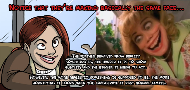
The grinning cartoon woman and the lady from the Black Hole Sun video are not making the same face. The cartoon woman looks as if she’s just made a harmless though snarky remark. The lady from the Black Hole Sun video looks like she’s both willing and able to take a chunk out of my skull, and intends to do it very, very soon. The difference is in the intensity of the gaze and the way that they’re showing teeth.
I looked at the Muppets with Eyes thing, and I just couldn’t stop laughing. They all look insanely silly to me, and I have no idea why.
Are you still reading your comments? I’d like to use one of your images in my blog..fully credited and linked. I’m just writing about learning how to draw and mistakes I’ve made and am working to overcome. Uncanny Valley is a useful concept to me.
sure